Sharpe Ratio and Drawdowns in a 1DTE SPX Strategy
In my first analysis of a 1DTE SPX strategy, I focused on the distribution of returns and how the strategy behaves across different market regimes and I ignored standard metrics like Sharpe ratio and drawdowns. I didn’t consider the Sharpe and drawdowns because these metrics generally assume returns are more evenly distributed and risk is well captured by day-to-day volatility. However, they still provide some useful insight into the baseline strategy. In this post, I take a step back and consider what these metrics say about this strategy.
The baseline 1DTE SPX strategy I tested had a number of interesting properties. It has a high win rate of about 82%. Yet it’s expectancy of -0.078 is negative. I found that the losses were unevenly distributed. They’re concentrated in a relatively small number of trades and they tend to occur under specific market conditions, i.e. higher range days. The upshot is that a small fraction of trades drive a large share of the overall outcome. This result is not reflected in the strategy’s Sharpe ratio and drawdowns.
The Sharpe ratio for the strategy is roughly −0.88. At face value this Sharpe indicates that the strategy has poor risk-adjusted performance. That conclusion is reasonable, but it also doesn’t say much about what’s actually happening inside the strategy. The Sharpe ratio averages over all the trades and summarizes the performance as a single number. It doesn’t show that the performance is being driven by a subset of bad trades. So while it’s useful at a high level and for comparison to other strategies, it’s not very helpful for diagnosing what’s working and what’s not about the strategy. In particular, it doesn’t show that most trades are relatively low risk while a handful of large losses determine the overall result.
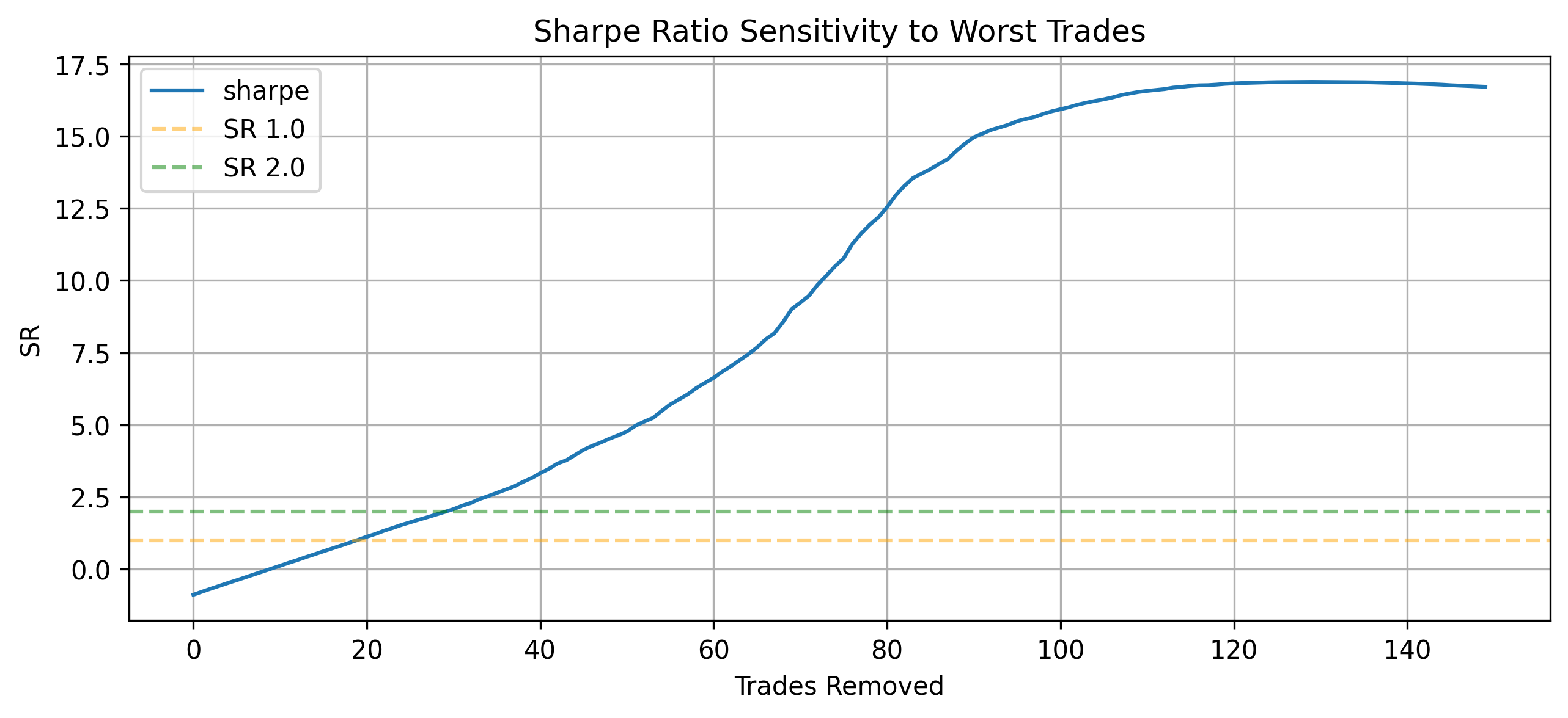
I created a clearer picture of how the tail risk of the strategy affects the Sharpe by simply removing the worst trades one by one and recalculating the strategy’s Sharpe. The below chart shows the result. We can see that the Sharpe is very sensitive to the removal of even a few trades. It quickly improves to 0 after removing the 10 worst trades and improves to around 2 after removing 30 trades. So removing just a few of the worst trades elevates the Sharpe to a level that might be considered attractive for a strategy. Of course, this doesn’t mean the strategy is necessarily promising. But it does demonstrate that the strategy’s Sharpe is highly sensitive to the left tail. Thus, the strategy’s performance isn’t driven by the typical trade, but rather a small subset of bad trades.
The original strategy experiences fairly deep drawdowns of about 30% and long stretches where the portfolio remains below its prior high. It never fully recovers from the final drawdown during the test period. When the worst trades are removed, both the depth and duration improve quickly. Removing just 10 trades cuts drawdowns roughly in half and leads to noticeably faster recoveries. Removing 30 trades results in relatively shallow drawdowns with much shorter recovery periods. These observations line up with my early analysis. The worst outcomes are not spread out, they are concentrated in specific conditions, and those conditions drive both the magnitude and persistence of losses.
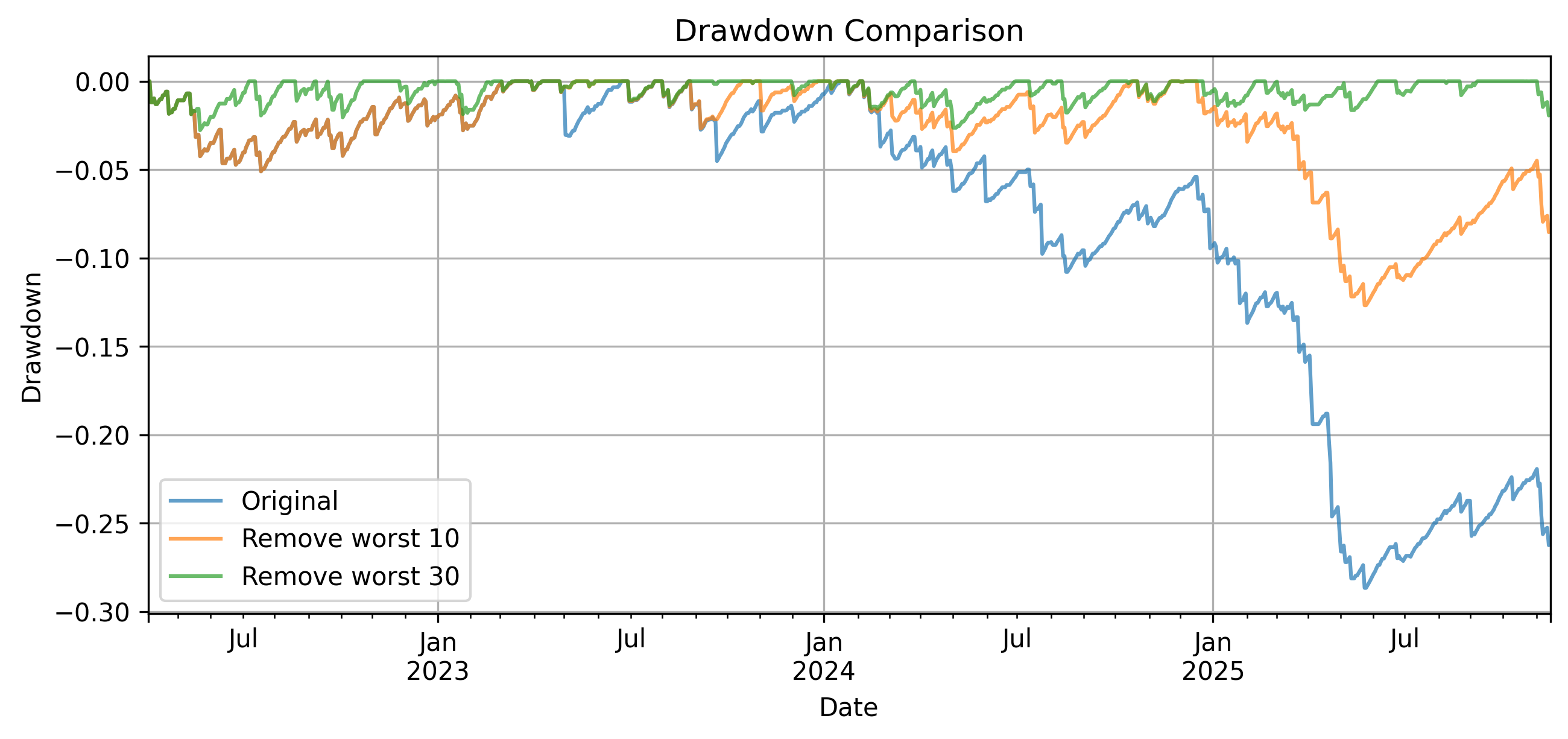
The drawdown summary statistics support these observations. The maximum drawdown improves from roughly −28.7% to −12.7%, and eventually to around −2.8% as more of the worst trades are removed. At the same time, the maximum drawdown duration drops from over 400 days to under 100. A relatively small number of trades is responsible not just for the largest losses, but also for how persistent those losses are.
| Scenario | Max DD | Max DD Duration (days) | Mean DD | Mean DD Duration (days) |
|---|---|---|---|---|
| Original | -0.287 | 463 | -0.080 | 100 |
| Remove 10 | -0.127 | 245 | -0.032 | 49 |
| Remove 30 | -0.028 | 75 | -0.008 | 16 |
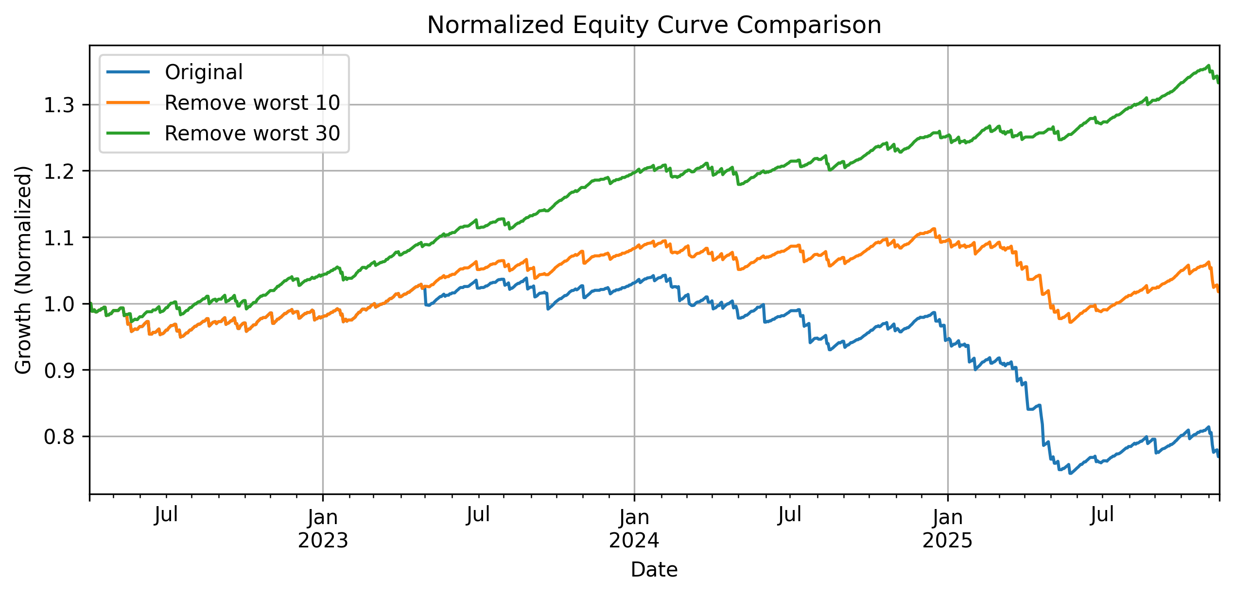
The equity curve makes the economic impact of this more concrete. The baseline strategy is roughly flat to declining, with sharp drops during adverse periods. Once a small number of the worst trades are removed, the curve stabilizes and begins to trend upward. Removing 30 trades produces a much smoother and more consistent growth profile. Again, these observations reinforce the same point from a different angle: the difference between a strategy that is difficult to run and one that compounds steadily comes down to a relatively small subset of trades. In the earlier analysis, I showed that these trades are tied to high range regimes. So the question becomes whether those conditions can be identified and avoided in practice.
These results help put the Sharpe in context for analyzing a strategy like a 1DTE SPX iron condor. Sharpe is useful as a summary statistic and for comparing strategies, but it conceals the fact that a few trades drive the overall risk-adjusted return. However, the original strategy is not uniformly bad. Most of the time, it performs reasonably well. Yet it’s vulnerable to specific regimes that produce outsized losses. Looking at drawdowns and the sensitivity to individual trades reveals that structure. In another post, I explored how the high range regimes these losses depend on are somewhat predictable. The next step is to test whether conditioning the strategy on those regimes improves its economic performance in practice.